The Scorecard Part 2: Architecture, Variables, and the "Free" Dark Mode
- Russ Morris

- Jan 13
- 7 min read
This is part 2 of a series of blogs outlining the design process behind "The Scorecard", a personal case study. Part 1 can be found here.

In this second instalment of "The Scorecard" case study, I am moving out of the discovery phase and into the design phase. This post covers how I transitioned from raw research into a structured, parameterised design system. I will be walking through my process of establishing a design base, architecting a multi-tier token system in Figma, and leveraging that structure to free the design from the constraints of a single mode or style.
Architecting the Engine Room
Coming from 15 years in digital products - spanning hands-on engineering, design and technical leadership - my instinct is always to look for the underlying structure of a product's design or technical requirements. For "The Scorecard", I didn’t want a "pretty" UI that was brittle; I wanted a parameterised design. Even for a solo project, I believe in building a foundation that allows for "pivoting without pain." Moving slower and more purposefully at the start allows you to move quicker at the end; if you rush to the finish, you often find yourself slowing down just as you reach the line.

When starting this project, one of the key goals I wanted was to work on a documented design system. Why? There is plenty of conjecture online about whether working in this way is entirely necessary - but for me, I believe it is. As someone more focused on UX rather than UI, I am invested not only in what is designed for the user experience, but the process behind how that experience is designed. I believe that a design system can improve the overall experience of the designer working on a project. A design system, no matter how small or personal, when correctly structured, can create consistency and flexibility not only for a particular product, but for all your future work.
This wasn't just about making things look consistent; it was about process engineering. By taking the time to properly structure the project at the start - defining spacing, scales, typography hierarchies, and grid systems - I wanted to ensure I could change my mind about a corner radius or a primary brand colour in seconds. This is the difference between "drawing" an app and architecting a product.
Creating the Design Base
The first step was identifying my visual "base." For an app with two distinct functions and types of information, I identified the need for two distinct typefaces - one for text-heavy content and the other for number and "stat" heavy content. I assessed how these typefaces looked and felt across different use cases - ensuring legibility in high-stress, outdoor environments while maintaining the brand's aesthetic.

Along with a foundational colour palette and shades, these formed the raw ingredients of the visual language.

Variables or Styles?
Figma allows the ability to create "styles." These are configurable, reusable settings that designers use to define the look and feel of an app and reduce the need to repeatedly type out values. Styles are well-established and useful, but limited. Variables are more difficult to set up and can be confusing to understand at first - but they allow for the creation of highly flexible design systems with further benefits for developers when it comes to implementing the designs.
For this project, I wanted to create a simple design system that made full use of variables.
Primitives and the Power of Variables
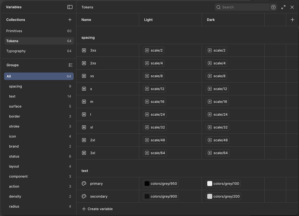
I began applying my base design decisions for the brand to a simple design system by creating Primitive variables. These are the baseline variables for my design - the specific hex codes, spacing values and typography settings that "The Scorecard" requires.

The real power here is the ability to change the app through these variables. If I correctly set up the system to use tokens, changing a spacing system or a base text size becomes a single variable change that the rest of the app follows. This level of control is incredibly powerful, whether you are working on a massive corporate platform or a small personal project.
Intent and Semantic Tokens
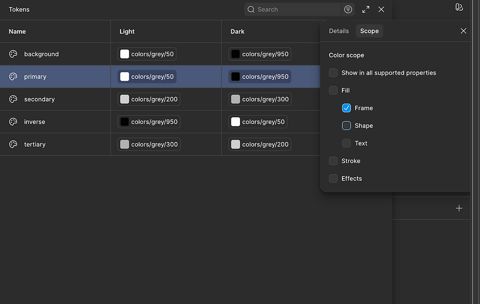
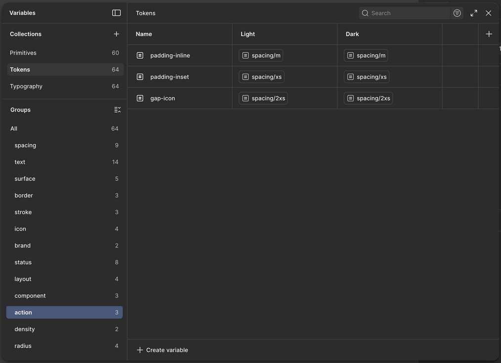
This is where we move from "what it is" to "what it does" by creating Semantic Tokens. Primitives like Grey-500 are aliased to functional names like action-primary-background or text-on-surface. This defines the intent of the design.

A critical part of this stage is "scoping" variables in Figma. By scoping, I ensure that when I am looking for a colour for a border, I only see the tokens meant for borders. This keeps the design process clean and prevents the accidental use of tokens in the wrong context.
I keep repeating this process for all parts of the design system - even at an early stage there is plenty to implement. You might not know absolutely everything you're going to need, and you are definitely going to need to make changes - but making changes to a design system that is set up correctly with variables, tokens and aliases is much easier to do mid-design.
You can get a good idea of the beginning setup of my token system below and see where links are made between primitives, tokens and aliases.


The Design "Bible"
With the architecture in place, I applied the "system" (the variables) to my "design" (the building blocks in figma). My Figma file now serves as a "bible" for the project, containing the tokens, their intent, descriptions, and visual examples. This provides a clear indication to any other designer or developer exactly what the system includes and how it should be used. It turns the design file into a living document that bridges the gap between a visual idea and an executable architecture.

Anything that exists in your design system should have a place where it is documented. It's really good practice to step through this process systematically. I like to have a list of all the variables I want to make and need in my system to get started, then I create them in groups, make the visuals, link the two together and move on to the next one.

Testing the System: From Wireframes to High Fidelity
Once this framework was established, I was able to move from low-fidelity wireframes into piecing together the actual designs. It is important to note that I wasn't working with fully-fledged components at this stage; rather, I was using the raw structure of the designs to stress-test the system I had built.

By applying the tokens to the layout, I could see exactly how the variables interacted with the actual content of "The Scorecard". This phase is vital because it allows for real-world adjustments and additions where required, ensuring the design system is robust enough to support the full product before the complexity of building components begins.

Modes, Scaling, and Accessibility
The ultimate ROI of this tokenised approach is the ability to create Modes. Because the system has a clear colour palette and semantic variables, creating a "Light" and "Dark" mode becomes a rapid process rather than a redesign.

As a quick overview, I have a colour palette that incorporates a range of 'shades', going from 50 (lightest) to 950 (darkest). For the grey shades, this essentially goes from my whitest colour to my darkest colour. In the default "light" mode my lightest colour is used for my primary surface or background and my darkest shade is generally used for my main body text. When switching to "dark" mode I aim to select the colour that is the complete opposite on the shade scale for that colour.

When "modes" have been created, they appear in the inspector in Figma - it's then possible to "switch" the "mode" - in our case, we switch from "Light" to "Dark" mode. It's worth noting that this setting can also be linked to variables and you could make light/dark mode toggleable within your prototypes directly.
This structure also makes accessibility features like font scaling seamless. In a tokenised system, I can increase font sizes or adjust contrast ratios globally to see exactly how the UI reacts. By parameterising the style, I am not just making the app look better; I am making it more inclusive by design.
That about wraps it up for the overview of the core parts of "The Scorecard" design system. In part 3, we will look more at the overall project, wrapping up the series.
Check back in on Tuesday 20th January 2026 for that.


Comments