
Role
UX research and design
Client
UX Design Institute
Duration
3 Months
Platform
Web
When
2025
Setting the scene
After 15 years building and designing digital projects, I decided to formally pivot and focus squarely on my product design skills, moving beyond programming responsibilities. I enrolled at the UX Design Institute (UXDI) to formalise my experience and create a structured, professional case study alongside my freelance work.
The project brief was simple: design a service that sells something to the user. I chose a hotel booking website. This platform presented an excellent challenge: taking a complex number of actions and user emotions and distilling them into a smooth experience while keeping my web skills sharp.
The core aim was clear: design a highly effective booking prototype - allowing users to search, filter, and book rooms - where every single decision was backed by user research and analysis to address genuine pain points.


The approach
My approach was dictated by the UXDI curriculum, which is rooted in real-world product design processes and rhythms. My work, spanning three months part-time, focused on a combination of linear research and analysis followed by an iterative design and validation phase.
I view the process as a fluid cycle, not a rigid pipeline. While the initial phases of research and analysis must be linear - you can't analyse what you haven't researched - the moment you move to design, the project shifts to an iterative loop. You begin with design, move to testing, and validate that design. What you learn from user interactions sends you straight back to iterating. The number of loops varies, but the key is to have conviction in your design principles while remaining open to change.
The entire process hinges on one fundamental truth: Assumption is the biggest risk to any design. To mitigate this, my time was split into clearly defined, evidence-based stages:
Stage 1
Research
Evaluating existing tools, user interviews, competitor analysis.
Stage 2
Analysis
Organising and synthesising data (Affinity Diagrams, Journey Mapping).
Stage 3
Design
Sketching, creating paper and lo-fi digital prototypes, and user testing.
Stage 4
Prototype & Testing
Testing the prototype and developing the high-fidelity component library.
Stage 1: Research
My guiding star for the research phase was simple: to understand the pain points and behaviours of users when using hotel booking websites.
Good products are designed with their users at the centre, and the only way to do that effectively is to truly know and understand our users. The research is intended to give us a better idea of their context, behaviours, goals, and pain points.
Qualitative research was the clear priority, as this project focused on gathering user experiences, perspectives, and behaviours. I conducted user interviews over Zoom, recording the sessions for later analysis.
I personally conducted two user interviews and also observed and took notes on a separate user interview conducted by another researcher. In total, six different hotel booking websites were tested across these sessions. This hands-on, observational approach was invaluable for uncovering non-verbal cues and genuine interaction struggles.
User interviews


Additional research was conducted through competitor analysis. This was not done to find out how to design a good website; rather, the objective was to understand the trends of the market and map the landscape of the space I would be designing in. This allowed me to strategically assess existing solutions, helping me understand what users are already accustomed to and where the gaps in the market,or the gaps in user experience, exist.
Market Context
User research insights
User 1
"There are so many filters.
It's quite overwhelming"
User 2
"I like that I can see my search details at the top - it makes me confident that the results are tailored to me"

User 2
"I'm never sure if the price is going to be what I pay...there are sometimes fees added at the end"
User 3
"I want to filter the searches as quickly as possible. 1,000 results isn't useful to me"
Stage 2: Analysis
With the raw data gathered, it was time to dive in and synthesise our findings. This process dictates the design direction, making it the most critical pivot point in the project.
Affinity mapping
Affinity mapping was performed on the insights and information acquired from the user research. I gathered useful information and views, then codified the data to identify common themes. This allowed me to determine a clear order of priority based on the frequency of specific views.

Journey maps
Next, I created a journey map that visualised the path the user takes through the booking process
Each stage of the map analysed the user's goals, context, behaviours, and pain points. This provided an excellent overview of the user's emotional state and the general ease of use at each stage. When you zoom out, it allows you to see the areas where you need to focus attention to ensure the user's experience doesn't hinder their ability to complete the core task. Journey maps are incredibly useful to intentionally assess each stage of your product journey through a variety of lenses.

Why not use personas?
Additional analysis methods like Personas or Empathy Maps were considered, but weren't necessary for this project.
-
Personas are useful when you need to focus design goals on a specific archetype of user, helping to communicate complex user segments to stakeholders.
-
Empathy Maps offer a structured look into what a user is saying, thinking, doing, and feeling, helping to align the team around a user’s emotional experience.
Neither tool was deemed essential for the desired outcomes of this analysis phase, as the journey map already provided the necessary context and highlighted the pain points we wanted to uncover.
Analysis outcomes
The synthesis of interview data through Affinity Mapping and Journey Mapping yielded a clear set of actionable product goals. While some features, such as building dedicated comparison tools, were deemed beyond the scope of this project, our design approach was guided by three fundamental pillars. These pillars focused on resolving user pain points, ensuring an engaging first impression and eliminating distrust and friction throughout the booking process.

Search Efficiency & Accessible Filters
Make the search and comparison process fast, functional, and rewarding. Solutions included implementing simple, status-aware filters to prevent visual overload, adding favouriting to aide comparison, and introducing visual feedback (animations) during search to confirm system responsiveness.

Transparency
Ensure total clarity on pricing and essential details at every step. This directive included perpetually displaying the fee-inclusive price and currency, presenting cost adjustments (e.g., breakfast) with immediate financial feedback, and ensuring clear photos and comprehensive hotel information were structured logically.
Clear journey map
Design a checkout experience based on the ideal journey map and user consensus. This was achieved by enforcing a logical sequence where payment entry is the absolute final step, and by ensuring the validation and consistent visibility of essential trip details (like dates and number of guests) throughout the flow.
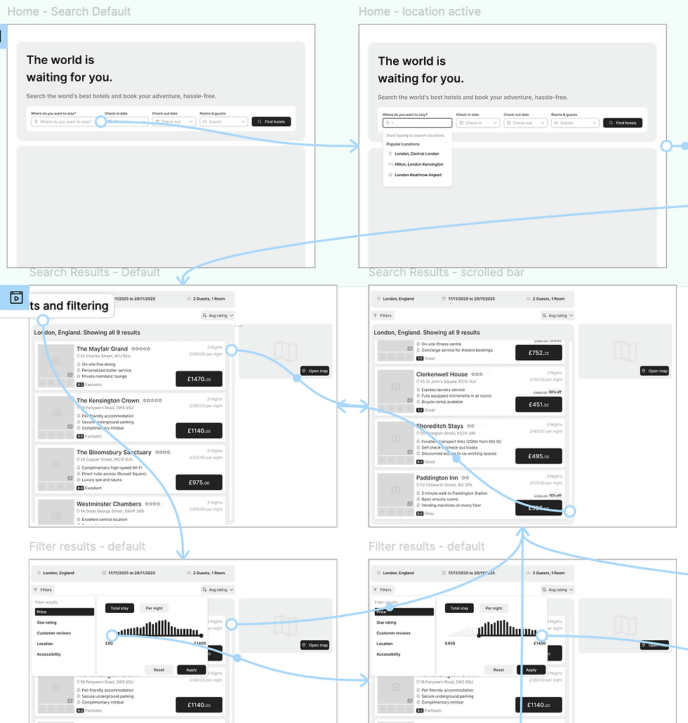
Stage 3: Design
Now that the research and analysis stages were complete, it was time to move into the iterative phases of design and validation. This section details our process, beginning with the foundational Sketching & Paper Prototyping and progressing to the Lo-Fi Prototyping used for early user testing.
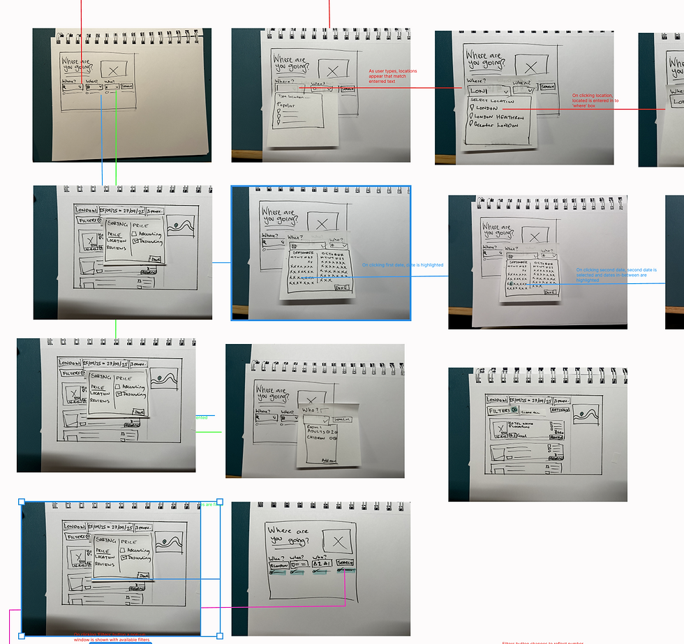
Sketching,paper prototyping and wireframes
The design phase began with sketching on paper to quickly understand the structure, hierarchy, and complexity of the information without committing prematurely. I then created paper prototype components that I could physically piece together and move around. This leverages my developer background, helping me find design cul-de-sacs that would typically only emerge during lo-fi digital work.
The core benefit is the design philosophy: focusing on the raw design fundamentals is key to preventing distraction by aesthetics. Having worked in this industry for 15 years, I know it's easy to use visuals to cover up underlying issues. Focusing on the raw design ensures the foundation is sound.
Medium-fidelity prototypes
I then moved into Figma, using the paper prototypes and basic components to create a medium-fidelity prototype. Even at this stage, design and structure are critical; poorly laid out designs distract users from their goals. To prevent this, I employed simple but unrestrictive design rules from the start.
This involved designing on an 8pt grid system and establishing strict layout rules right from the start. Although a 4pt system might be used later, the 8pt grid is perfect for this stage as it efficiently establishes fundamental visual and information hierarchy.
The goal was to make the full user journey accessible for testing. I tested this design with users to learn:
-
How are users scanning the layout?
-
Where are they looking for information?
-
Are their expectations being met when it comes to interaction?


Design progression


The design phase consisted of rough sketching, wireframing, paper prototypes, and digital designs. Each stage contributed to a deeper understanding of how to best support the user experience.


Design outcomes
The user testing and validation process immediately led to critical design changes.
This section is divided into two parts: first, the solutions driven by analysis (confirming our initial research directives), and second, we look at the iterations driven by testing (addressing new friction points revealed by users interacting with the prototype).
Solutions driven by analysis

Engagement
Addressing the user finding of a "lack of excitement" starting the search, we implemented design elements to make the system feel friendlier and more responsive. For example, when the user inputs their search queries, the system provides an animation to communicate the technical loading process in a user-friendly way. This visual confirmation establishes a relationship with the user by instantly rewarding their input.

Filter overload
To counter the user pain point of "filter overload," the main filter menu was hidden behind a prominent button. The search results page then dynamically displayed the number of active filters, ensuring they were accessible but not overwhelming.
Tracking information
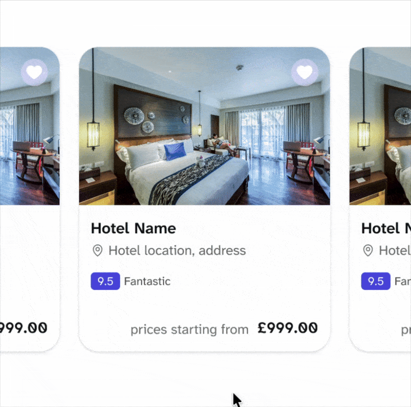
Addressing the difficulty users had with comparing listings across multiple tabs, a simple and visible 'save' or 'favourite' button was implemented directly on the hotel result cards. This provided an efficient way for users to shortlist hotels without disrupting their primary search flow.
Iterations driven by testing

Automation
Users wanted the search fields to auto-advance to the next stage without a manual click. This aligns with Alan Cooper's view that a product should strive to automate routine tasks, which supports the 'efficiency of use' principle. Since filling the fields is a linear process, removing the manual click dramatically increased the efficiency for the user.

Information clarity
Users require confirmation of the total nights included when selecting dates. I resolved this by adding a simple label next to the date inputs that clearly displays the calculated duration. This quick fix validates Nielsen’s 'Visibility of system status' and confirms the user's mental model, assuring them: "I arrive on the 17th and stay 3 nights," validated right there on the screen.

Design clarity
Further iteration highlighted a design issue where too many distinct 'boxes' of content made the website feel segmented rather than a holistic experience. By decluttering the layout, we allowed the content itself to take focus, rather than the containers. This was crucial when moving to higher fidelity designs, resulting in content that was less segmented by distinct areas.
Stage 4: High-fidelity and delivery
After gathering enough information during the design and validation rounds, I moved on to higher fidelity prototypes. While the course only required a medium-fidelity output, I chose to take the product further to a level suitable as though I would be seeking stakeholder sign-off and initiating the development process.
This is where the product is polished to reflect a real-world experience, presented to stakeholders, and prepared for developer handover.
Stakeholder resonance
The primary purpose of the fully polished prototype is to invoke the same feeling as the 'real' thing. I aim to include the full range of interactions and features, drilling down to the core parts that make the features truly resonate with people.
I find the word ‘prototype’ is sometimes hidden behind, used to justify cut-corners or skipped features that developers are left to interpret and implement. This shouldn’t be the case; the fidelity must be high enough to persuasively demonstrate the final user experience and gain buy-in.

Developer handover and specification
The second purpose is to provide a clear, unambiguous blueprint for the development team. This is where my years of hands-on development experience come into play; I'm always thinking about how to build what I'm designing. To achieve this, the focus shifts to creating a robust final component library .
This is immensely helpful for my design process, as it continues the 'toolbox' way of building, and directly solves the challenge of creating a technically feasible design for developers.
The final component library, design, and prototypes are always supported through clear documentation and notes, ensuring all the necessary details are there to fill in any gaps the development team may have.

Addressing the core user pain point of hidden costs, the high-fidelity design ensured absolute clarity on pricing. The selected currency and the total fee-inclusive price are now perpetually displayed at the top of the screen . Furthermore, options like breakfast or cancellation coverage are presented with clear, immediate feedback showing the user the exact incremental cost before they add the item.
Full transparency

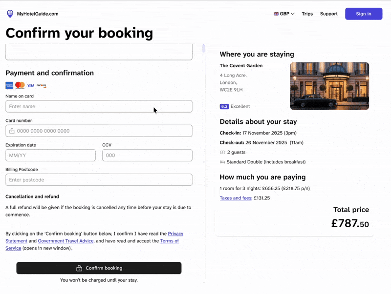
The checkout experience was finalised to reflect the ideal journey map and participant consensus. This validated flow prioritises essential room details upfront and, most critically, reserves payment entry as the absolute final step before confirmation. This sequence builds user confidence by confirming the booking details and the total price before requesting sensitive financial information.
Check it out
Feedback
Giving feedback is crucial to engagement. The high-fidelity prototype highlighted the importance of this principle and ensured the system provided instant feedback to the user whenever they interacted with content, such as hover states, subtle animations on button clicks, and confirmation messages after form inputs .


To ensure the user felt confident that the results matched their needs, the active search criteria (location, dates, and number of guests) were always presented to the user above the search results. This allows the user to recognise that the system is addressing their specific request, rather than needing to recall what they originally typed into the search bar.
Confidence
_gif.gif)
To maintain user awareness of their location within the overall platform, the main site header remained sticky throughout the experience. This constant presence affirmed the site context and prevented users from feeling lost or disoriented, reinforcing the 'where am I' knowledge.
Maintaining context
_gif.gif)
On complex hotel details pages, an interactive navigation toolbar was implemented. It stacks neatly underneath the hotel name as the user scrolls, allowing direct jumps to sections like 'Rooms' or 'Reviews' . This ensures all information is immediately accessible, supporting recognition and eliminating the need for users to remember where specific details are located.
Supportive navigation
Guided walkthrough
This video provides a complete, guided presentation of the final high-fidelity prototype. Join me for a step-by-step tour as I walk through the entire user journey—from initial search and filter application to the final, transparent checkout process—highlighting the specific research-backed solutions implemented in the design.
Project outcomes
These final takeaways are more personal than professional. Unlike a live client project, there are no A/B tests or conversion metrics here.
Instead, this case study’s success is defined by the quality of the process and the lessons learned outside the typical constraints of a commercial build.
The value of focused gestation
For me, the most beneficial part was getting the time to focus solely on research, analysis, and design without the pressure of a simultaneous commercial build for the first time in years. This freedom allowed me to sit and gestate over the ideas completely, ensuring every design decision was validated by user research.
While my technical background meant I always considered feasibility and build complexity (I didn't want to suggest an unfeasible design), the exercise allowed user needs to be the absolute, undisputed priority.
Product is process
The ultimate learning from this project was the powerful confirmation that The quality of the final product is rooted in the process.
While, in the real world, there is rarely the opportunity to put every desirable step in place - and the process is never perfect - this project reinforced a crucial constant:
If you strip everything back, the user is always core to the design. Regardless of the approach or the time constraints you face, the most effective solution is the one built around your user's validated goals.